MadMen
  • BLOG
Creative Copywriting BMC 2434

Week 12: Reflection

11/22/2014

4 Comments

 
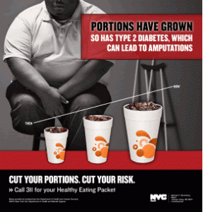
In Advertising there some ethical approaches that are required in order to have a suitable and likeable ad for the audience. Respecting the truth and being honest to the viewers are important to credible copywriting.  Meanwhile, spreading untruthful facts can be dangerous and will consequently result in losing the trust of the audience if it is proven a lie.  Advertisement must be written based on facts, without altering the product’s features or concealing its flaws. If there is a wow-factor, it is imperative to showcase it to the audience in an attempt to further convince them to buy the product. Elaborating on the wow-factor and providing a reliable source will help to alleviate audience skepticism. Furthermore, decency is one of the crucial considerations in pursuing an ethical advertisement. An ad should oblige to the standard of the regulator and so,  it cannot be offensive. Think of the risk by not regarding decency; the ad would appear insensitive. This can damages the brand image because an offensive act will be remembered for a long time and audience perception of the brand is negatively changed. For example

 By Muhammad Syady Nayatra Rasyid 0307574

4 Comments

Week 12: POM ad

11/21/2014

4 Comments

 
Picture
This is a print ad from POM Wonderful that claims that their promegranate juice could reduce blood pressure. This print ad is deemed ethical because it does not state that this product can completely remedy high blood pressure problem. With the headline that states “Decompress” we can clearly understand that this health product can decrease one’s blood pressure and ASA can’t argue that this ad is abiding the law. The body text mentioned that this health drink helps to guards your body againts variety of health problems. It does not state that it can entirely protect all these illness. Besides that, the body text has also stated the desired amount of consumption in order to achieve the desired result. Therefore, there is no dishonesty in this print ad. As for the visual, it explains the whole idea of the print ad because it shows the blood pressure monitor on the bottle means if you consume this drink, your blood pressure is going to be as low as the drink. This is overall a simple and straightforward ad. In addition of the help of the body text, it also gives audiences more understanding for this product and how it is scientifically proven that it works.  

By Pauline Kam
Source: 

4 Comments

Week 12: Save the Children

11/21/2014

3 Comments

 
Picture
This newly released ad by Save the Children hopes to increase awareness of child labour and improve the legal framework to protect children in Dhaka, Bangladesh. The idea of this ad that shows a child working being framed inside a mirror box that make it looks like being immortalized in a museum, aims to visualize the tagline in the ad "we must make this a thing of the past" is truly a brilliant and very eye catchy idea. This ad definitely lays a leading role in combating child labor by making it in a very creative way, it, increases consumer awareness, pressing companies with child labor in their supply chains to take action, and engaging governments on what they need to do to address the issue.  Powerful !


By Ariel Ezra Bezaliel 
Source:http://files2.coloribus.com/save-the-children-child-worker-2875


3 Comments

Week 11: NYC Health Department

11/15/2014

3 Comments

 
Picture
I have choosen a rather different type of advocacy advertising. Here, is a advertisement done by the NYC Health Department to promote healthy eating. Deciding to take the risk, they have chosen a scare approach where the advertisement would make you feel rather uncomfortable especially if you are one of those on going the problem or might be getting into it. Hence, this advertisement would work best on a person that has similar problems and people who enjoy sugar based beverage or food. Here, we have a man that is above the average weight with a amputated leg. Confirming on how he lose the leg was due to diabetes which is commonly caused by intaking too much sugar. Hence, this would make people think a thousand miles feeling scared on whether this same problem will encountered by them. It would take a bigger hit on people that are above average weight or people whom loves sugar. The colors used are rather well portayed as this is a public service announcement, Red and black are usually the color of danger.

By Irene Cheen Pik Yee 
Source: http://www.healthnewsreview.org/2012/02/questions-about-scare-tactics-in-health-advocacyawareness-campaigns/
3 Comments

Week 11: Reflection

11/14/2014

3 Comments

 
Press realise is the fastest way and easiest way to get free publicitiy. Therefore, writing a good press realise is a must for attractive the reader. Firstly, for sure headline is one of the most important thing In every press realise, therefore grab attention with a good headline, make it creative and attractive. Strong headline (for that matter , email subject line when you send out the pitch) will pull in journalist seeking good stories , the headline should be as engaging as it is accurate. Secondly, Get the right point in the first paragraph, every important point should be addressed in the first beginning sentences, and the subsequent paragraphs should be supporting information. Otherwise, GRAMMAR! Make it grammatically flawless, before sending it out, must check carefully since even single mistake can dissuade a reporter from taking you seriously. Make it straight to the point, one page is the best , and two is the maximum, the shorter the better. This will also force you to condense your most salient information into a more  readable document , something journalist are always looking for. Lastly is about provide some good quotes, even if there is no, think about it. Say something that can grab people attention and something memorable and personal, if it possible. 

By Svensson Yap

3 Comments

Week 11: Toyotabharat

11/14/2014

3 Comments

 
Picture
This is a corporate ad for Toyota. First what I like in the ad is the picture’s association with the ad. Toyota is advertising their ‘Toyota Express Maintenance’ where customers can get periodic maintenance services done in 60 minutes and assistance by the roadside anytime of the day, whether it be day or night. The picture of a marriage indicates trust, where both spouses can rely on each other in facing any problems. Their headline “Reassurance is knowing that someone that someone is there for you, no matter what” and “Toyota is there for you, for life”, further shows Toyota’s pitching for quality customer service. They also put in their unique selling point which are “60 minute express maintenance. An unmatched of 3 years or 1,000,000 kms”.  The color used in the ad is a light shade of brown, making the ad not too dull or too bright. This makes the ad a little better to read than those with bright colors, which when being too bright makes people not read the ad. The fonts used in the ad are also easy to read as they are just in the perfect size for the amount of info written in there. The spacing also helps in the reading of the ad. 

By Alif Alexander
Source: http://www.toyotabharat.com/Images/q-promise2-big.jpg


3 Comments

Week 10: Reflection

11/8/2014

3 Comments

 
A persuasive fundraising letter would start off by whom the letter is written by. A convincing authority that calls for a fundraising will be more credible compared to a normal person. Besides that, providing statistics and charts about needs of your organization on fundraising is going to aggravate your audiences. Instead, choose one impactful story to tell is going to attract your audience on reading your letter and contribute to your organization. Call for action is a very important element to be included in the fundraising letter for the reason that it has to sound emergency and anxious thus audiences will react to it right away.

 A reply slip should be included as well. Furthermore, the envelope shouldn’t be negelected because it is an important part of the fundraising letter and overall fundraising package. After all, it needs to be designed in such a way that gets the donor to open it. A teaser from a story that will be included or a stamp that reads “Emergency Appeal” will actually attract donors to open them right after they receive the package.


By Pauline Kam
3 Comments

Week 10: Hawes & co brochure

11/7/2014

3 Comments

 
Picture
This brochure from Hawes & Co, a real estate agency from the United Kingdom is simple, yet attractive and eye-catching to the viewers. At first glance, people will obviously be attracted by the visual and the vibrant colors. The drawing is so creative and funny in a way because it is a drawing of a person’s head in the shape of a house with the headline “Are you thinking about a new home?”. The “think” and “home” they implemented in the visual makes it quite cool and in my opinion, it really is a new way to execute the brochure this way rather than just a flat and mundane real estate brochures, which usually only shows a sample of new houses and a number on it. By looking at this brochure, people will feel and have a perception that this company has a good taste and ultimately, encourage them to give the company a call. For viewers to act upon the ad is basically the advertisers’ main goal and for them to get contact with the company is what the real estate agents aim to gain. You might be curious why the benefits are not stated there? The truth is that Hawes & Co is famous already in the UK since it was established in 1988. So this brochure is more intended to show that they are the superior company in the UK. Using an art on flyers nowadays is really trending like for concert, party events, etc.

By Muhammad Syady Nayatra Rasyid

source: tesredburn.co.uk/hawes-and-co-5


3 Comments

Week 10: Atlas brochure

11/7/2014

4 Comments

 
Picture
This brochure from Atlas is definitely an example of the most effective and efficient ad  The biggest and most common mistake that is made when writing a brochure, is focusing too much on the information instead of the persuasion. This brochure definitely on the right track, it is not too wordy yet informative. The copy write is more enticing to the audience because it gives them a reason to follow the message in the brochure. Also, the main message of this brochure is conveyed perfectly because there is a clearly dominant message and goal. As we all know, multiple phrases asking the audience to do certain different things can be confusing and the reader can loose interest when there are too much information involved yet does not give a concrete solution or answer the reader's question, hence this brochure definitely a good example of a focus and simple  copy writing. Furthermore, this brochure embody a good example of a good brochure because it quell the reader's fears (pregnant woman) and it brings the reader to take action and take steps to order the product. 


By: Ariel Ezra Bezaliel

4 Comments

Week 9: Reflection

11/1/2014

4 Comments

 
New media advertising no longer can be of simple and plan methods as they use to be. In short, everyday people’s attention spans gradually growing shorter and shorter. The revolutionary items that technology has brought us have advanced us as well as crippled us. For example print media no longer can be as simple as they used to be using just black and white with normal fonts, but rather it has to be engaging, colorful and excites the senses of the consumers. 

Hundreds of brands are constantly battling everyday to leave an impression upon the consumer’s reasons why their brand and product should be the item that you should consume. Even the digital media is not spared, for advertising needs to be pro-active and carry the consumers on a journey. Thus cross platform advertising is an ever vital method that advertisers need to look into using various media platforms all as on together.

By: Irene Cheen
4 Comments
<<Previous

    Group Members

    Ariel Ezra Bezaliel •  Alif Alexander • Irene Cheen • Pauline Kam • Syady Nayatra • Svensson Yap Suen Sheng

    Archives

    November 2014
    October 2014
    September 2014

    Categories

    All
    Week 1
    Week 2
    Week 3
    Week 5

    RSS Feed


Powered by Create your own unique website with customizable templates.