By: Alif Alexander
Source: Curtispachunka.com, (2014). curtis pachunka. [online] Available at: http://curtispachunka.com/Dodge-Great-American-Car [Accessed 11 Oct. 2014].
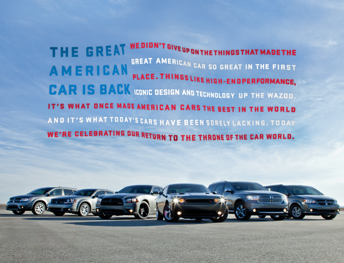
The ad that I will be analysing will be the Dodge ad, an American brand of automobiles, minivans, and sport utility vehicles manufactured by Chrysler Group LLC. This ad is rather simplistic, with the product of cars being shown with the background of the sky behind the product. There are two interesting points about the body copy that attracted me to this ad. First is the colour of the fonts used in the ad. The colours used in the ad are actually the colours used for the American flag. The fonts used also give a somewhat professional and serious tone to the ad. Their headline “The Great American car is back” and the subsequent body copy helps to reinforce their idea that this car was made in America, for Americans to drive. Another interesting point is how the words are arranged. The combination of colour of the fonts and the layout of the words give us a picture of the American flag even though they are just words. Their sentences in opinion are just long enough for someone to read without losing their breath, even if the whole paragraph might not be interesting for those who don’t use Dodge brand cars.
By: Alif Alexander Source: Curtispachunka.com, (2014). curtis pachunka. [online] Available at: http://curtispachunka.com/Dodge-Great-American-Car [Accessed 11 Oct. 2014].
4 Comments
Muhammad Syady Nayatra Rasyid 0307574
10/12/2014 02:36:10 am
I agree that at your first glance of the ad, you are instantly attracted to the style of the body copy, which is designed to emulate the american flag. The brand of the car itself, Dodge, has crafted a well-known iconic image of an American vehicle since long ago. So by applying this style, it is a really good way to reinforce the brand’s patriotic value. The color of the fonts definitely enables audience to easily recognize the flag style. Not to mention, the content of the body copy is focused on luring americans to support on buying national products. The point is to sell the idea of the Great American dream. 10/12/2014 02:48:36 am
Although this print advertisement might be a bit too graphic for some, I love how Dodge ad come up with sentences that formed a shape of American flag that truly strengthens the message of this ad. Also, because Dodge has such an iconic message and design, they don't always have to try too hard to try something particularly clever or involved to make their point. The overall layout and design are brilliant with everything from the colour to the shading popping out of the page.
Pauline Kam
10/15/2014 01:02:32 pm
Although the idea of putting their body text into a american flag shape is creative, but I find the texts a little hard to read and I literally lose interest in reading till the end. Because the cars are already-visual and the texts looks visual too, it makes this whole print ad too visual orientated.
Pauline Kam
11/26/2014 11:03:12 am
Re-edit: Leave a Reply. |